ANCHORwell
– The story
ANCHORwell offers home medical testing solutions. Developed by a nurse who is passionate about empowering women to take charge of their health, these tests provide the opportunity to handle life’s curveballs in stride.
Take the helm with your life.
– The Services
Brand Strategy and Identity Design
Packaging Design
– The Collaborators
Brand Identity Design
Lydia Kitts of Turnquist House
Client
ANCHORwell
– The Palette

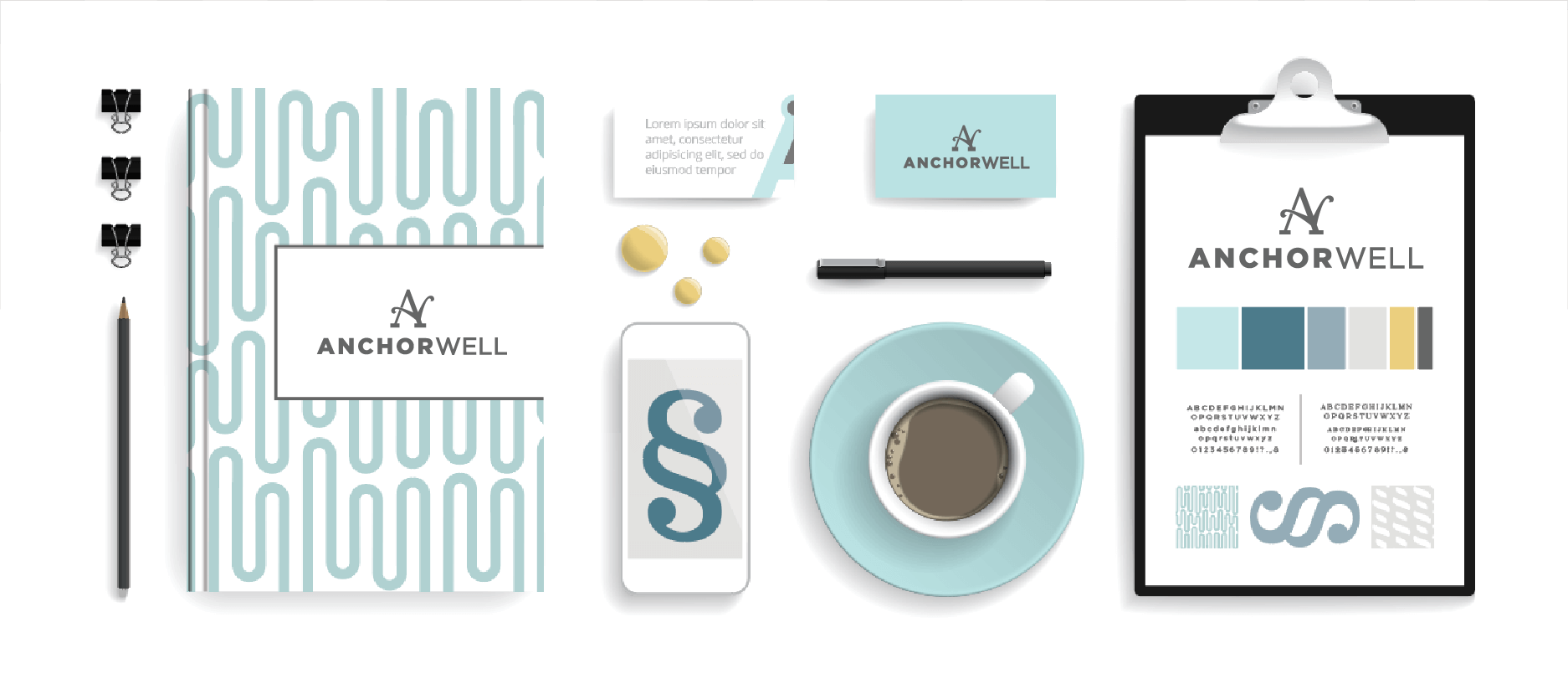
This gentle, gender neutral palette does some heavy lifting behind the scenes. Competitors use bright, bold colors with strong hues that are almost neon in nature. When applied to packaging this palette dramatically differs from competitors, providing a gentle and reassuring presence. Exactly what a worried mother will be drawn to when trying to care for sick children.
– The Situation
ANCHORwell needed a brand identity to translate well onto packaging - helping the brand visually stand out from the crowd while building a graceful trust with the women using the products.
Serving women ages 20-35 who are trying to conceive or with young families. Brianna shared that her client is prepared, planning ahead for life's challenges. She is elegant, bold, classic, whimsical, and loves clean lines. She appreciates gender neutral designs.
– The Design Solution
This logo pays subtle homage to anchors, the female reproductive system, and a stethoscope without being obtrusive in its allusions. The letters "A" and "W" come together to make the mark. A strong sans-serif typeface in two font-weights breaks up the name into two distinctly separate words.
– Marks and patterns
The mark incorporates a bold sans-serif typeface with subtle and elegant nautical details to create a unique identity with room to grow.
- The primary logo splits into two separate entities to create a secondary logo and submark.
- The secondary logo is a simple wordmark to be used in areas with a lower profile (say the side of a box), and the submark can be used independently in even smaller locales.
These patterns can be used virtually anywhere that you'd like to add a little bit of movement. Pattern One is reminiscent of waves in the ocean, a heartbeat chart, and the rhythm of life. Pattern Two brings in a touch of warmth and strength with gentle lines, based off of rope and braids.
– The Inspiration




– The Typography
Both are strong, yet elegant designs that convey professionalism. These fonts are easy to read, adding to the brand's story while giving it room to grow into a large medical company, or being applied to their other ventures.
The sans-serif font has a great weight to it with many different font variations to help organize content within the designs.
The slab-serif font should be used sparingly, it is beautiful but is better preserved to emphasize important information and attract attention to specific copy.

– The Typefaces
Sans-Serif: Gotham Medium - find it here -> Hoefler&Co, Typewolf Guide.
Serif: Rival - find it here -> Adobe, Creative Market.
– The Style Guide

– Field Notes
This project was a fun one! Brianna was a great collaborator - but just as important... she had a product I could get behind.
I loved this project because it pushed my boundaries a bit - asking me to think about packaging design instead of a purely digital brand (something I hadn't done since grad school!).
Non-traditional monograms are such fun to create, especially when exploring how the letters interact with each other, the vision, and the business name.
- lydia kitts

